
CSS - a dropdown menu with a triangle
# Summary
A triange can be made by a element with the following style
	1. width:0
	2. height:0
	3. border-width
			the value of it depends on the margin-top of dropdown
			normally, half value of margin-top (caz you have top and bottom border)
	4. border: solid transparent
		transparent is needed for overlapping background-color taken from parent element
	4. border-bottom-color
	5. content (if it is a pseudo element)

To make menu item look like centrally align, simply just use `padding`
2
3
4
5
6
7
8
9
10
11
12
# Notes
So I saw a css effect and was wondering how that was made. It used around half an hour to identify that effect, just because I paid attention to a wrong html tag 😦
The css effect I want to know is shown in the following picture.

The triange that the red arrow points to is the one I am taking about. Shortly speaking, position + pseudo-classes:hover + pseudo-elements:before plays the role (IDK why they use :after, it seems unnecessary).
So how they do that?
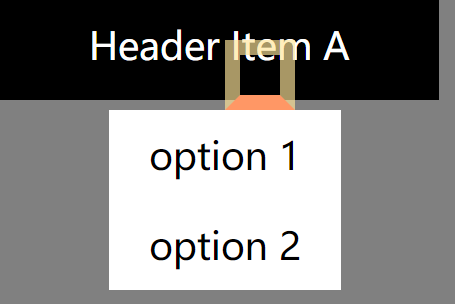
# Step 0. make a dropdown list
First, you need a menu item or anything else to be a reference. Let's say, the menu. So, set that menu as position: relative; Then, surely we will have pseudo elements :before and :after as absolute position elements according to the menu, which appear when the pointer hovers onto.
Now here is what we have by now.
	<style>
	html *{
		font-size: 15px;
		padding: 0;
		margin: 0;
	}
	html{
		background: grey;
	}
	.header-menu-item{
		width: 10rem;
		min-height: 1.5rem;
		padding: 0.5rem;
		text-align: center;
		background: black;
		color: white;
		position: relative;
	}
	.header-menu-item ul{
		display: none;
	}
	.header-menu-item:hover ul {
		list-style: none;
		color: black;
		background: white;
		position: absolute;
		left: 25%;
		margin-top: 1rem;
		display: block;
	}
	.header-menu-item:hover ul li{
		padding: 0.5rem 1rem;
	}
	</style>

	<div class="header-menu-item">
		<a>Header Item A</a>
		<ul>
			<li>option 1</li>
			<li>option 2</li>
		</ul>
	</div>
2
3
4
5
6
7
8
9
10
11
12
13
14
15
16
17
18
19
20
21
22
23
24
25
26
27
28
29
30
31
32
33
34
35
36
37
38
39
40
41
42

# Step 1. attach a pseudo element to the menu
Then, attach a :before same as what ul do. The code below is what I saw from the site and I extracted the attributes only needed for this effect.
.header-menu-item:hover ul:before{
    content: " ";
    position: absolute;
	bottom: 100%;
    left: 43%;
	border: solid transparent;
    border-bottom-color: rgb(225, 225, 225);
    border-width: 0.5rem;
}
2
3
4
5
6
7
8
9

This is kind of like a piece of magic code. The pseudo element is just an element with a bottom border and attached to the top of dropdown menu, so why is it a triange?
After some attempts of changing the attributes, the theory behind magic is revealed.
What you can see in this picture is the :before element with width and height more than 0. Normally you will use border with a element has some size, then surely it is a border. But if the element has no size, it becomes a triange, and the direction of that triange is according to what attribute, such as border-top, border-bottom you use.
So what does a "triangle" element contains?
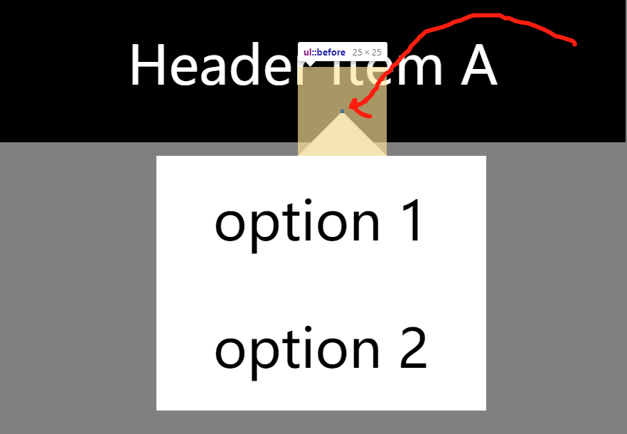
The tiny content(I set w&h to 1px) is at the center of the element and the rest is the trianges/borders. And the way to adjust the size of triange is to use border-width.
# The full snippet of code
<style>
html *{
	font-size: 15px;
	padding: 0;
	margin: 0;
}
html{
	background: grey;
}
.header-menu-item{
	width: 10rem;
	min-height: 1.5rem;
	padding: 0.5rem;
	text-align: center;
	background: black;
	color: white;
	position: relative;
}
.header-menu-item ul{
	display: none;
}
.header-menu-item:hover ul {
	list-style: none;
	color: black;
	background: white;
	position: absolute;
	left: 25%;
	margin-top: 1rem;
	display: block;
}
.header-menu-item:hover ul li{
	padding: 0.5rem 1rem;
}
.header-menu-item:hover ul:before{
    content: " ";
    position: absolute;
	bottom: 100%;
    left: 43%;
	border: solid transparent;
    border-bottom-color: rgb(225, 225, 225);
    border-width: 0.5rem;
}
</style>

<div class="header-menu-item">
	<a>Header Item A</a>
	<ul>
		<li>option 1</li>
		<li>option 2</li>
	</ul>
</div>
2
3
4
5
6
7
8
9
10
11
12
13
14
15
16
17
18
19
20
21
22
23
24
25
26
27
28
29
30
31
32
33
34
35
36
37
38
39
40
41
42
43
44
45
46
47
48
49
50
51